Lets face it we’ve all been there, entering a beer store looking to only buy a few beers and ending up with a basket full! This comes with the urge for a craft beer enthusiast to seek out some new adventures to experience as well as something that catches their eye as they browse. There are many avenues which influence our decisions, we have our friends recommendations, review websites to check for ratings, as well as the knowledge that a certain brewery is known to produce class beers. Yet still, the sheer volume on the shelves can make it a hard decision for a craft beer enthusiast to narrow down a few. On top of the vast selection what we are met by is a library of art, our eyes are being caught by the designs portrayed on the beer, ranging from simplistic to minimalistic, from edgy to goofy and all other sorts. The saying goes never judge a book by its cover, and this holds true in the beer world. Great label art doesn’t necessitate the quality of the beer is parallel. But subconsciously we may be attracted to a beer because of its artwork. There has always been an unexplained connection we have with certain pieces of art, it is to us, our minds representation of the real world in a way, or rather the artists view of the world or subject and we use art as symbolism to portray what we see around us. Sometimes its not always clear, but this connection we have to imagery and comparison seems to transfers over to the beer world as we browse the selection each store brings us. Now not all art might have some deep rooted meaning, but the influence is ever present. Now as mentioned, really good artwork doesn’t always translate into the taste of the beer, but above the name itself and our recommendations, the labels play a huge part in consumer marketing. As craft beer enthusiasts, we often put all our attention on the taste of beer and forget about the other aspects of the brewing industry. Design. It can go as far as to setup the branding for a brewery but beyond that the product can act as an open canvas for artist to demonstrate their creativity and identity. What our eyes see is the final product, but what we may not see is the extensive work that goes behind creating such iconic or popping label artwork. Where does this inspiration come from? And what are some of the artists thinking when creating a vision which will attract customers?
Being a 3D artist myself, working in film and television, my eyes are always attracted by good beer artwork. In my industry however I am not able to feed my creative side. It is mostly spearheaded by the art director or supervisor and we follow those directions without much freedom to dream or create. In the world of beer label artwork, freelance artists are brought in to preform the design work or some artists are given a specific longer contract to design labels for that specific brewery. Through my adventures in craft beer here in Quebec I have noticed a large rise in craft breweries, but along with that I observed an increase in the diversity of label artwork. Some of the old classic style labels seemed to have transformed into a new age of art. Designs became more eye catching and seemed to pop more, as if there was a new art revolution occurring.

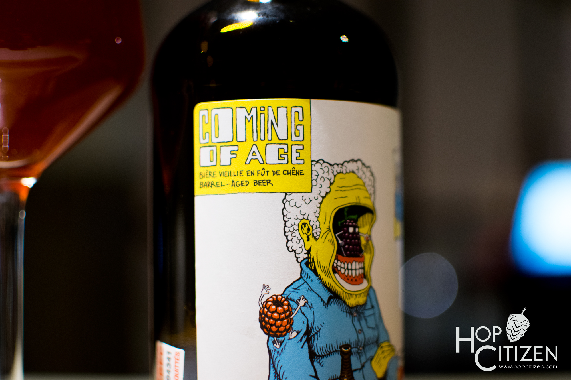
First and foremost these designs vary according to the artists personalities and inspirations. Each one brings their own character into their work and they themselves certainly play a large role into what the final product may portray. Chris B. De Muri describes himself as “a looney kind of guy,” well actually he told me insert the first word that comes to my mind, and with the artwork he does for Matera it seems he must have a looney fun personality! He has done some interesting work with Matera, from the eclectic label for Coming of Age to the serenity of the man meets nature label of Beau Bouquet. Matera has allowed him some freedom so he is able to construct some ideas of his own creation and show some first passes to the fine folk at Matera and the creativity continues from there. Much like Alex Mercier, the artistic director for Brasserie Du Bas-Canada for the last three years and a graphic designer for five years. At Du Bas-Canada he is in charge of their branding as well as some illustrations for their cans and bottles.

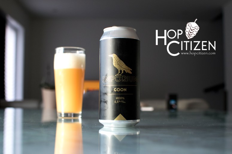
He is inspired by collage, typography, photography and illustration and uses those different pieces to create a full result. This mixed medium approach creates a very diversified combination, creating a fusion of different flavours in the final design. Olivier Pelletier, under the banner of Fardoche however, takes a far different approach. While some artists explore their own creative minds, Olivier likes to explore the creative minds of his customers before he starts. Olivier has a long list of clients he has created visuals for, but foremost I reached out to him because of his work with Emporium Brewing. There was something about this artwork that really spoke to me with its Gatsby 1930s like feel. Upon asking Emporium what they were looking for, they explained to him they really wanted to incorporate a crow in their logo, but that feat wasn’t as simple as it seemed. “It was obvious that you couldn’t make a silhouette or a simple raven drawing, it had to have a unique graphic treatment” he explained. The owners we intrigued by steampunk style of concepts and with his keen eye Olivier was able to land on an edgy art deco design, which is focused on more structural and architectural feel. First popping up in art history during World War I but really taking speed in the late 1920s, this style can be seen used in two iconic buildings that tower over the New York City skyline, the Chrysler building and the famous Empire State Building. And of course this kind of style was plastered all over the 2013 film adaptation of The Great Gatsby. Olivier felt this style was “less confusing and more structured than the steampunk,” which I tend to agree with. Olivier’s approach creates a very edgy line oriented design and with the gold it really makes it pop!

Bénédicte Pereira Do Lago who works as a freelancer as well as with for Dieu Du Ciel, has more of a marketing approach to her work. She tries to keep the style of beer in mind when creating her designs and focuses on popping out from the shelves to pull customers to grab the beer. Even still with her geared focus on a more marketing approach, art is always fun! “As for my inspiration, the name and sometimes the style of the beer will influence my ideas. Usually I’ll scribble a bunch of ugly sketches to put my idea on paper. I often have to refrain from going too far in the silly jokes that makes me laugh!” she exclaimed. Working for Dieu Du Ciel, a well-known brewery, it comes with a volume of production like no other. Working along side Leila Alexandre the brand director, the label work goes through a more lengthy processes, it is truly a marketing machine! And the end result still produces some incredible eye popping designs.
A lot of the designs out there may have been methodically planned out to pop out from the shelves but many seem to be more of a personal display of work, Chris Muri speaks about his fun filled label art “As for the cartoony style, I’ve always been drawn to this kind of art, cause I feel like it’s the perfect middle ground for funny and weird to meet, for cute and trash to go hand in hand! It’s also the reason why I think it’s a great fit for the beer market. Since it’s targeted to a mature public, it’s fun to be free to add second degrees of reading to images that look, at first glance, like they were meant for a kids audience. Also, it’s way more fun to create than serious stuff” I find this dichotomy of displaying more cartoony artwork usually meant for children, but with more of a mature content for adult audiences, really represents to a certain degree the craft beer community. There are certainly many of us which are fun loving and looney and can appreciate this kind of artwork on some of the beers we want to discover.

Where some might be a bit more looney, others are a bit more simplistic, Mark Rickerd from Wood Brothers has a process and focus far different when coming up with their designs, “I wanted something clean and simple to state the opposite of what is mostly out there now, Let the product speak for itself not the label.” This bold approach has created a design which replicates their environment, “I wanted something that said we were rural and a farm brewery that makes hoppy beers, so I thought half hop half tree would represent wood brothers well.” This rural brewery feel is shown in their cans with a simplistic logo with intricate lines mimicking a tree displayed over craft paper, which creates this wood and rustic minimalist design, which echoes Wood Brothers vision as a small rural brewery with a bold punch. He also drew his inspiration from some of his favorite breweries who showcase similar concepts such as Hill Farmstead and Maine Beer Co. Both of them use the concept of one simple graphic or a simple text. Although minimalism may seem super straight forward to most, it comes with some trial and error as well as some luck! “The craft paper is the closest thing we could find to something minimalist and rustic, things just came together I guess, the logo was not gonna be enough but add the craft paper behind and all of a sudden we had a look people liked but no one else had, and trying to find something no one else has nowadays is not easy,” explains Mark.
There is always a variance with how artists approach the start of their projects. Alex, begins with a very old school way to cone down his visions, “Before starting a new project, I like to create a mood board that allows me to identify certain elements or approaches that I’d like to incorporate in my illustrations,” he explains, much like the work of a story board artist for a feature film to determine which camera moves will work best, the way to cut and edit certain shots, as well as movement of objects, vehicles and character. “This research can help me step out of my comfort zone and explore new avenues. Problem-solving is, in my opinion, an excellent source of motivation and inspiration. Trying to find an approach that “fits” perfectly with the context is an integral part of the process,” he continues. “As for the final result, I am my own worst client. Being satisfied with something is not always easy. In the end, I think it’s important to have fun exploring different perspectives and ways of doing things in order to surpass yourself as an artist.”
Going from concept to final can be a long arduous road, but like all artists do, we persevere and power through the countless ups and downs to seek the vision which we so admire, and in a sense completes us. Although all fellow artists will know, echoing what Alex mentioned, in our minds there is really no final. Any work we do can be pushed further, we just use our deadline as a means of calling a piece of work completed.

Olivier, as mentioned really wants to complete the vision of his clients, and uses his talents to really dive in to their minds and extract the concepts, translate them with his own skills and present ideas which can send his clients through a rollercoaster of consent emotions! “More generally, I try to understand the brewery before proposing something and I always try to use other working methods for each customer, whether by graphic style or by illustration technique. I try as much as possible not to have visual signature,” keeping this idea of having a more client based touch, rather than a personal touch can be showcased with his long line of diverse clients in the beer industry. Speaking further about Emporium, he mentioned to me that there are more upgraded visuals to come in the following year! Looking forward to see what Olivier has in store.
With Bénédicte working for Dieu Du Ciel the process is a bit more streamlined, but being part of a large machine doesn’t mean creativity can’t be free. She was tasked with creating the label for Limonade Poivree, the process began with a little tasting “I had a lot of ideas with this one! I had tasted the beer at the end of 2019 and really liked it. The combination of pepper and lemon seemed very funky to me! So I imagined something that has punch, a science fiction lemon or psychedelic concepts where the pepper was visually rendered by some texture effects or the color black.”
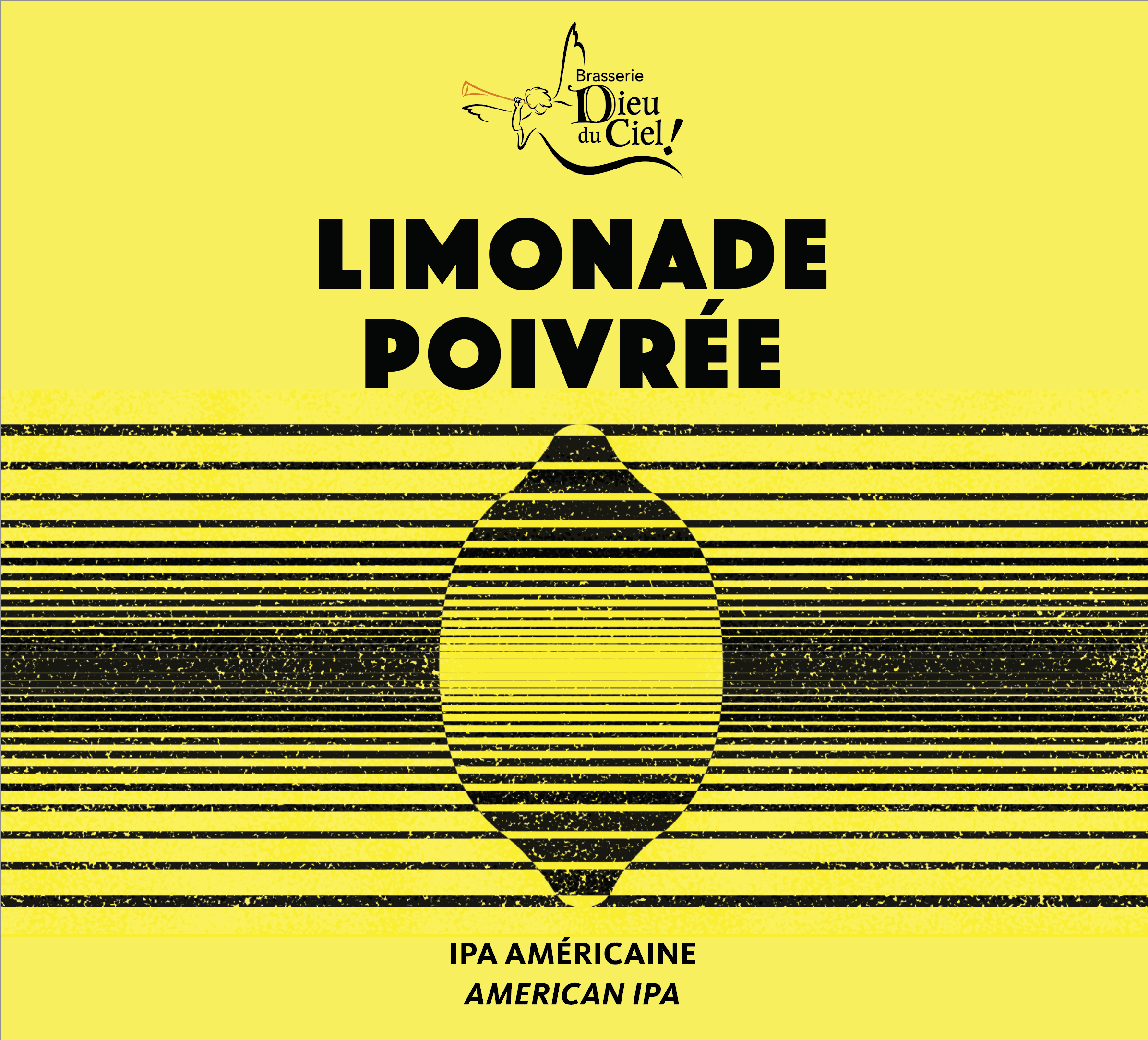
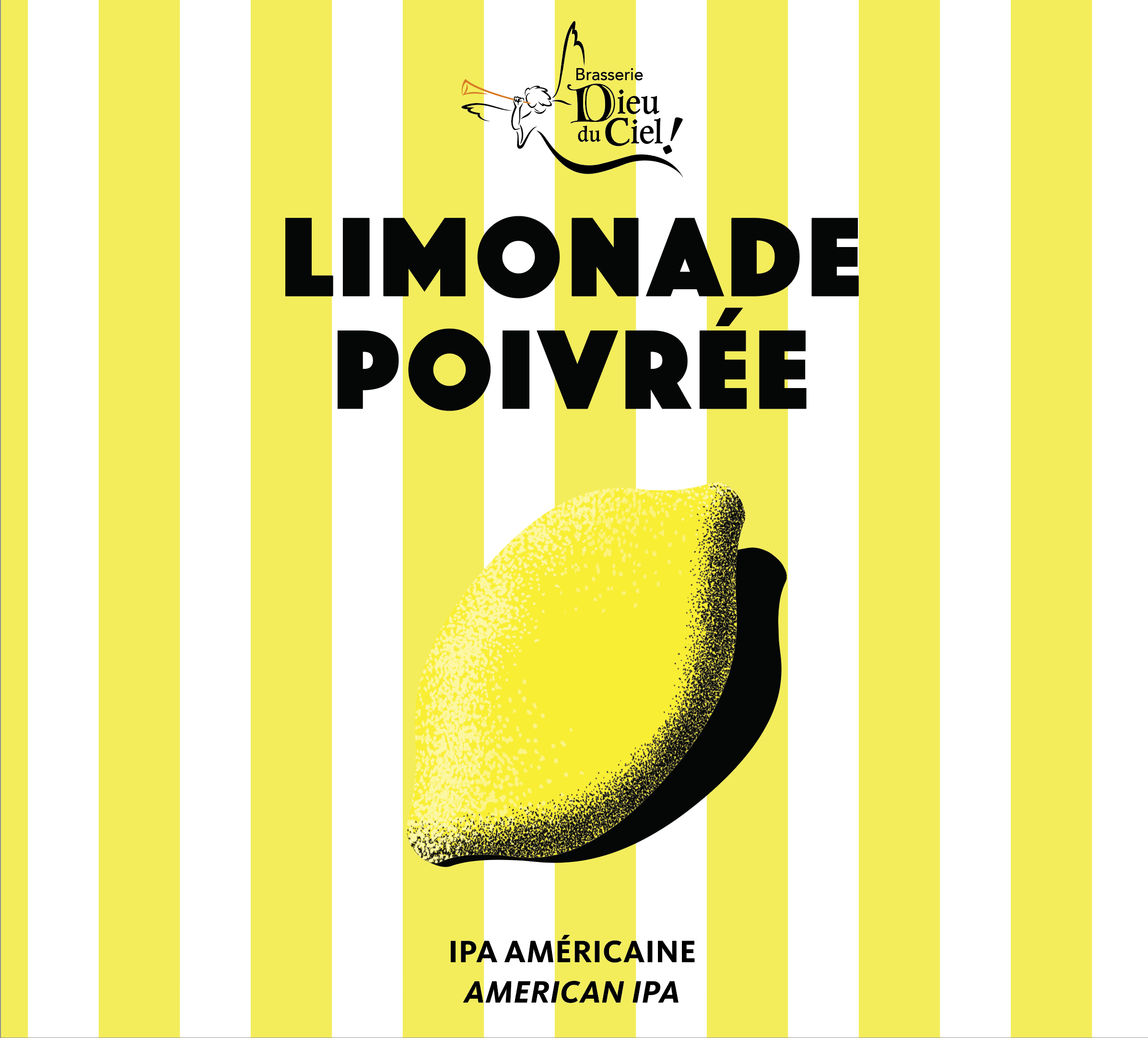

After drafting some concept she presented them to the team, and the final although not satisfactory to her personally, did the trick! “The team wondered – with reason – if it was going to sell well and if it was not too far from the taste and concept of Lemonade that we wanted to highlight. After all it’s a 3.5% light beer! So in the end we opted for a design which wasn’t my favorite, with a more classic design but which evokes much more lemonade and summer than psychedelic space. It seemed to be a good choice!” she explained of the final chosen design.
I can relate all to well to this anecdote, since in my industry as explained earlier, artists don’t have the end say, which is okay because it is the art directors visions. And sometimes we have to go with it because it is not us running the show! One day maybe!
Who knew as a beer drinker, you were not only drinking the hard labors of the owners and the brewers, but also the people who create amazing visuals for all of us to admire, snap photos of, share on Instagram, identify and admire. And this only touches on three aspects of what gets you to a final product, lets not forget the rest of the people involved. Suffice it to say, there is a lot that goes into a can or a bottle that you eventually consume. And for me as a fellow artist giving a nod to the artists from the beer industry seemed like a duty I had to touch upon! Cheers all ya artists out there! You Stay Hoppy Montreal!